Thursday 30 December 2010

Costume Realisation

From my original design for the character of the Lion being inspired by the 'Beast' in Bele et la Bete (A film I studied in the research phase to explore and gain a greater understanding of the concepts within narrative and genre.) I have developed this design to translate the context within the chosen genre better - see design development below.


We can't dispute the fact the main character is in fact a Lion in this fairytale story - this is why I decided to incorporate lion qualities into my design. Despite developing the design the qualities and features of a lion still resonates just in a more stylistic way. From changing a grand, royal outfit into a cultural, iconic dress I was able to still hold onto the 'grand' qualities of my original design to reflect the Lion's characteristics within the play but able to also tune into the Western genre through visually displaying symbolic features, take for example the Indian head dress.

Bible Sheet - The Lion Prince


(Refer to A3 Bible Sheet for further detailing and realisation of costume)

Sunday 26 December 2010

Model Box Production

The beginning of this process required working closely with the plans drawn up on Auto CAD. Working in 5mm thick foam board I used the plans to produce a layout plan onto the top layer.


Technique 1: Laying the plan out flat onto the foam board and scouring carefully through the top layer. Then removing the plans and finishing off cutting using a set square, metal rule and a sharp scalpel to gain a definite, neat edge.


Technique 2: When drawing a curve I found the paper plan needed to be secured in position in order to produce a neat curve. I used drawing pins to anchor the plan in place - making sure I pierced a section of the foam board which was going to be discarded.

Lighting rig
To gage the distance between each lighting beam I decided to work on top of the plans to speed up this time consuming and fiddly section of the model box. I needed to take care though as each beam needed to be at the correct distance apart - this was in order for the lighting designers and set constructors to understand where I (the designer) wanted the cloths and any specialised lighting to be hung from for the production.


Each individual beam was cut and allocated to a slot in the 'roof' of the model box. This was achieved by cutting into the foam board until the bottom layer of board - excess foam was scrapped out using a ruler to create a hollow space for the beam to slot into and to be later glued in place.


Supports were needed underneath the stage floor - this was to angle the front and back face of the model box correctly and also to prevent warping of the black card I used for the side panels beneath the stage floor.

Underneath section showing supports


Double sided tape seemed to work well here - luckily my tape was 5mm thick and so was the foam board.

Taping two sides of the right angled triangular supports

(Note to self: buy tape at the same or similar width of the board as it will save you a lot of time and pain!)

To achieve a neat finish 5mm strips of black card was cut to fit and applied around the edge of the foam board edges to hide the foam.

Model Box


Lion leaning on Proscenium Arch


Now having completed the basic structure of the model box I was able to concentrate on and realise my set design through the scenographic model. I produced the 'Lion' in 1:25 scale to enable me to gain an instant comparison when making the set - this was done by simply scanning my drawing into my computer and changing the size in AdobePhotoshop. I produced the figure to be the representational size of myself just in a 1:25 scale form! Backing it with mount board and painting black for a professional and sturdy finish.

Sunday 12 December 2010

GoogleSketchUp Visualisation

Working with the plans produced on Auto CAD I was able to upload these with desired objects and position them accordingly - working in the dimensions of the actual scale.


This programme enabled me to gain a sense of perspective and scale within my design.


Figure's eye line - actor on stage perspective


From this I can realise visually that my chosen design concept was going to be 'massive' in scale and it would therefore create an overpowering effect upon the performers on stage instantly.

Tuesday 7 December 2010

Revolve stage layout and truck movement

To realise my set design the element of a revolve stage and a series of trucks is required.

To visualise and scale of these trucks at the actual size I found planning with a combination of layers on AutoCAD worked well.

Positioning of trucks at the beginning of scene


Positioning of trucks after transformation


From this I was able to visualise the scale, positioning and space the actors had between the trucks and on the revolve stage. As a result from using this method I can refer to this at a later stage, say if the director/choreographer wanted more room for the performers I could easily alter the size of these elements and be able to realise the effect this change would make in an instance.

Construction lines are useful

In order to create the scenographic model for my set design, technical drawings of the Royal Theatre Margate was needed to be produced. This led me to delve in the world of AutoCAD...

Working from the given drawings of the venue I first converted the scale of the original plans to work out the actual scale of the stage. From this I drew my version of the Theatre Royal to actual size, then plotted my drawings at the scale of 1:25 in order to attain the right dimensions for producing my model box. Fine I thought until it came to printing the plans...I knew far well I couldn't print this drawing on one sheet as I only had access to an a4 sized printer. So with a little guidance I decided to plot and print the plans in a mosaic-type fashion. One problem when not printing in one section, you have to be talented in joining up the lines (joining up I have found is not my strong point!) To overcome this I drew construction lines (diagonally) on my drawing (see screenshots below) to provide me with a guide.

AutoCAD drawing of Proscenium Arch with Construction Lines


Plan View AutoCAD drawing with Construction Lines

Thursday 2 December 2010

The set model beckons...

After developing my ideas and realising the concepts within the design, I have delved into the genre of western culture/native America more with the association of cowboys and Indians taken from the wild west genre. By taking this genre forward I feel I can translate the narrative of the 'Lady and the Lion' more imaginatively and symbolically in style.

Within this design process I was eager to come to a definite decision near the beginning as to what genre I should use. But by allowing myself to explore more than one genre not only visually but culturally too, I have been able to realise that there is more meaning to my design then I had originally anticipated.

My final design has translated the original narrative into a native American setting. The elements of native American culture has allowed me to reflect my idea accordingly - having a giant tepee instead of a grand castle, forest of cactus's in comparison to trees.

The hardest transition was deciding on what could symbolise the Lion's precious rose bush which the father of the 'Lady' picks from. Then the idea of sacred burning embers came to mind! Indians are known for being tribal and very traditional in their celebrations - consisting of chanting and very lively dances around a blazing campfire. Therefore the idea of translating the father picking a precious rose into capturing a sacred ember I felt would reflect the narrative appropriately.

When considering other factors concerning this genre, the surroundings and overall set dressing of the set should reflect the deserted, natural, open land of sandy ground and neglected earth (see background image in transition concepts for example - previous post). The characters within this play would also need to communicate this genre through costume and behaviour. In my eyes the Lion should be a native Indian - taking ownership of the grand tepee and the father and his servant should be cowboys on horseback riding through the 'Cacti Forest' discovering the castle (well tepee!) and the beautiful garden behind.

Costume Design- 'Lion' in the Wild West Genre

Scale Matters


Human height for 'Cacti Forest' would enable the actors to interact with the whole of the object - feeling more in control. Good - when considering the movements required in the scene change. The castle at the beginning of the play is not featured in the play, because the forest is on trucks the actors would be able to move the cactus's to a position where the presence of the castle can be visible at the penultimate moment.


Grander, more overwhelming feature. Good - communicates the sense of fear and anxiety, the purposeful feelings of the forest in the play and also gives the audience and actors uncertainty of what lies behind or within this 'great' forest.


Now lets consider and apply this to the rest of the design concept.
[Playful times in Adobe Photoshop]

BEFORE TRANSITION I


AFTER TRANSITION I


In this scale the forest works well in disguising the presence of the castle - although would the forest have a greater impact if the castle was smaller (naturalistic size?).


BEFORE TRANSITION II


AFTER TRANSITION II


In this scale the forest definitely dominates. Good for reflecting the powerful forest surrounding for the performers to travel through, although deters the impact of the 'grand castle'...perhaps the castle should be larger? Also I feel the castle is more disguised in the previous layout as the tops of the cactus's hide the interesting element of the tepee.


BEFORE TRANSITION III


AFTER TRANSITION III


Now in this scale the castle clearly dominates. This reflects the castle's stature well, standing proud and grand - like a castle should. Good for translating the Lion's status (owner of the castle) also. Although there's one slight problem with this scale...the purpose of the forest trucks does not fit. The purpose of the forest was to not only provide a stimulating area for the performers to engage with and travel through on stage, but it was also a key element in disguising the castle's presence at the beginning of the play, in order to deliver the surprising impact upon the audience.

Different sized Cati adds to absurd qualities


Outcome
I feel the correct scale for my objects is to be of similar height and large (relating to 'Transition I') because:
1. To translate an absurd, fairytale, non naturalistic feeling to the design.
2. To reflect the grand essences of a naturalistic castle.
3. To deliver a surprising impact at the point of revealing the castle to the audience.

GoogleSketchUp Experiementation

Wednesday 1 December 2010

Western Development

From being spurred on by Chris's input, I took a look at the two examples of 'iconic domes'.


St Peter's - Rome


National Gallery - London


By analysing their structure it is clear to see how size, shape and decoration can play a huge part in translating the correct message. From what I can see, the dome of St Peter's in Rome is very dominant in stature as to its bold shape and detailing - which can be seen from a far. This instantly gives the audience a macho impression ( just what I need for my castle translation!). When comparing this to the National Gallery dome, I realise the comparison in size (smaller) encrusted detailing (weak) and surrounding architecture (less impact) is virtually opposite to that of St Peter's, hence communicating the alternate effect.

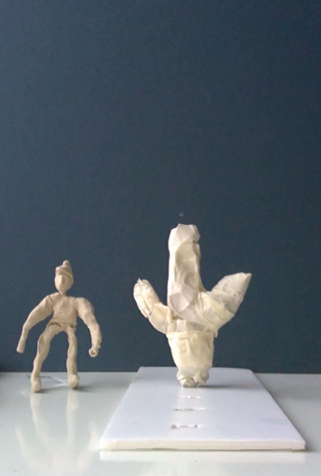
In my design for the 'Lady and the Lion' I am going to apply these findings and developmentally experiment with different designs of tepee to translate a similar 'macho-ness' to that of St Peter's including Lion qualities to reflect the narrative.

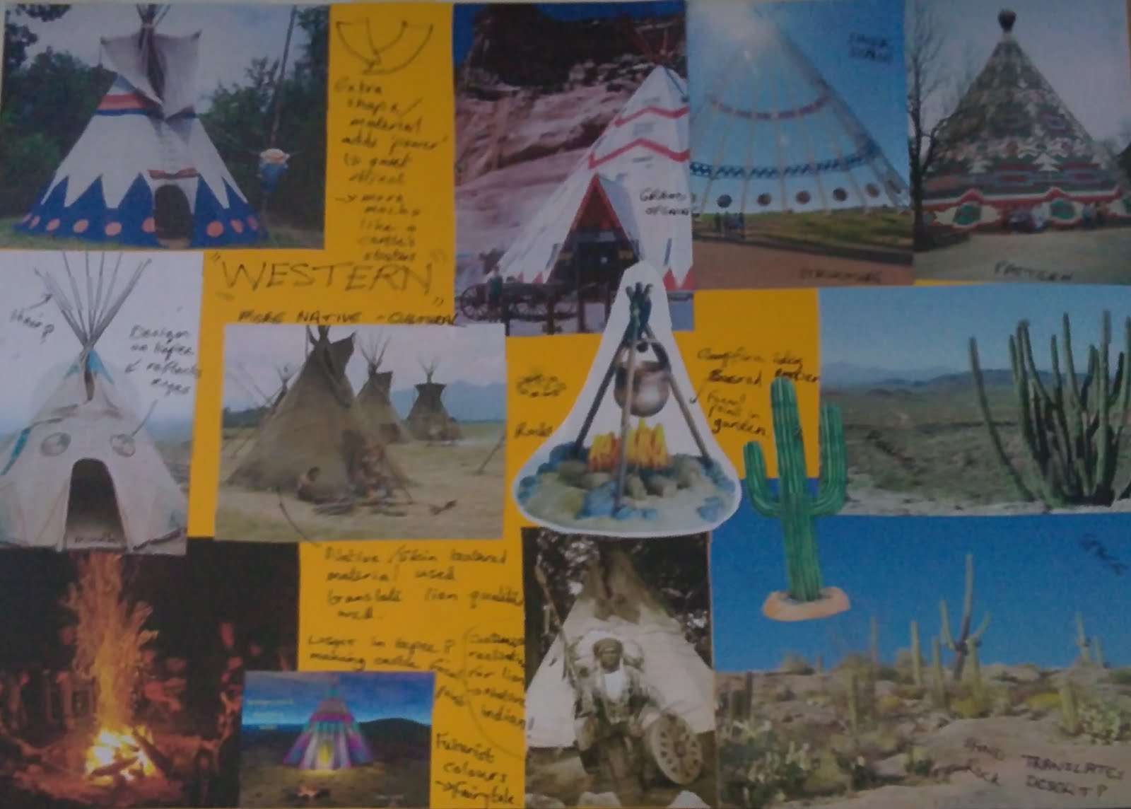
Western Culture Mood Board


Features/Findings:
Some tepees incorporate certain shapes into their decorative design covering. Circles if applied in the right pace can translate the feature of eyes and vise versa, a hollow opening can communicate an open mouth.

I've seen on some tepees to have extra material at the top of the structure, this material can seemingly give the quiet object power, and therefore in my case communicating the macho qualities of the Lion's castle. This also gives the object a focal point (near the top) making the stature grander.

Texture: the native Indians cover their tepees in an earthy coloured cloth material (like that of a potato sack) Materials such as Hessian or burlap would be used - a coarse woven fabric usually made from jute fibers and allied vegetable fibers. I sense this incorporated into my design would reflect the skin/fur, earthy, wild attributes of the Lion in the narrative well.

One tepee image I found drove me to think about having internal lighting in the 'castle' - making the castle the focal point but not only that it would encapsulated the audience into the realms of fairytale if say I used non naturalistic more intense colours.

Throughout the cultural world tepees have been designed and produced in many different ways to communicate messages and feelings across society. Structure, pattern and scale are just a few words I can use to describe the difference between them all. Shape is a key element - in all tepee images I have sourced there is one repetitive element....and that is the original shape (without this it wouldn't be known as a tepee). So from this I can be certain that by changing qualities within this element won't change the genre but can translate the narrative by including certain desired qualities (eg. using a texture to reflect the Lion).

Lion's Castle Design Ideas

Repetitive jaggered pattern, to symbolise the Lion's sharp teeth stylistically through colour and pattern. But doesn't speak much, apart from being 'pretty' and decorative thus symbolising a 'decoratively' grand castle.

In this design although being very symbolic in colour and abstract in shape and pattern I feel the Lion qualities and powerfulness are being reflected more - take for example the teeth surrounding entrance, abstract rectangular shapes translating the lion's nose (bringing the tepee character and life). Also the shapes used around the bottom of the cover in my eyes communicates the shape and style of the Lion's tails - giving the object a sense of 'motion'. The rods are sharp and strong to symbolise the teeth again - giving the object continuity.

Other elements
Cati: This plant is very symbolic and has a distinguished appearance in shape and colour. I could play around with these qualities to translate the feeling of empowerment and the sense of fear surrounding the play.


Quick sketch: developing the powerful essence through imagery and scale. The 'Cati Forest' on the left I feel makes the tepee less powerful, on the other hand it would create an overpowering setting for the actors to interact with on stage.


Further development - play around with these two basic shapes changing their scale (giving them alternate and similar sizes)and see which delivers the best impact.