Alexandrian, Sarane. 1970. Surrealist Art. Thames and Hudson: London
Baugh, Christopher. 2005. Theatre, Performance and Technology : The Development of Scenography in the Twentieth Century. Palgrave Macmillian: UK
Carol Ann Duffy and Tim Supple. 2003. Collected Grimm Tales. Faber and Faber Ltd: London.
Clapham, Walter C. 1974. Western Movies. Octopus Books: London
Clarens, Carlos. 1997. An Illustrated History of Horror and Science-fiction Films. Da Capo Press: New York
Cleave, Andrew. 1995. Big Cats – A Portrait of the World. Todtri Productions Ltd: New York
Davis, Tony. 2001. Stage Design. RotoVision : Switzerland
Grunenburg, Christoph. 1997. Gothic. The MIT Press: Cambridge
Humble, Richard. 1994. English Castles. Artus Book: London
Levitt, Annette Shandler. 1999. The Genres and Genders of Surrealism. Macmillan Press Ltd: Hampshire.
Martin, Syliva. 2005. Futurism. Taschen: London
Oggins, Robin S. 1994. Castles and Fortresses. Friedman Group: New York
Orton, Keith. 2004. Model Making for the Stage: A Practical Guide. The Crowood Press: Wiltshire.
Rulon, Bart. 2002. Artist’s Photo Reference : Water and Skies. North Light Books: Ohio
Thorne, Gary. 1999. Stage Design: A Practical Guide. The Crowood Press: Wiltshire.
Williams, Gilda. 2007. The Gothic. The MIT Press: Cambridge
Winslow, Colin. 2008. The Handbook of Model-making for Set Designers. The Crowood Press: Wiltshire.
Winslow, Colin. 2010. The Handbook of Techniques for Theatre Designers. The Crowood Press: Wiltshire.
Thursday 20 January 2011
Conclusion
On reviewing this project the scenographic model played an important role in translating my design through one visual record. The development of the design concept can be seen through the additional photographic storyboard - breaking down the transition.
The concept of Narrative and Genre led me to understand and pin point factors within a certain genre to be able to successfully execute a design for the stage. The main scenic element of the Castle within the narrative of the Lady and the Lion ultimately changed to a giant tepee. My initial ideas held tightly onto the concept of it having to be a castle, but when developing my ideas I realised it could be something other than what it was supposed to be. My research and development led me to realise it could still be delivered as successfully if given familiar and similar qualities. Take for example the castle was grand and powerful, by making the tepee grand and powerful I was able to translate the same effect upon the audience. I enjoyed changing the elements within the narrative to something other. I feel it added to the fun of fairytale, where anything is possible - so by having gigantic Cacti was pleasantly acceptable.
Through text analysis, research, design, technical engagement and process application a set for the stage was able to be produced, communicated through a strong genre. Not only was the genre concept interesting to consider, the scale factor and sightlines in relation to the performance space added an extra dynamic to consider.
To be critical my engagement between the original technical drawings and model box production could have been more focused to iron out any imperfections within the production stage. Although my technical understanding of using Auto CAD seemed engaging and enlightening for me, a few errors did arise when producing the model box (e.g. the stage depth being to short and not including the wing space on the foam board plan). Despite this I took it upon myself to alter and adapt my model box accordingly as I felt this was down to not checking plans against my work when I should have.
Personally I felt this unit enabled me to grasp the concept of self motivation. By being my own boss in a way (with the input from others at certain points) gave me the opportunity to make vital decisions of design and development. This journey gave me the confidence to act on my instinct and experiment even if things didn't work out as hoped!
If this project was developed further the essence of the realisation of production could have been realised and developed by producing this in full scale. Although when considering this concept, it may be a somewhat daunting task to behold. Working alongside skilled craftsmen and women, directors and technicians would make me have to consider other things such as costing and budgeting - if the money doesn't stretch the design could be worthless. In my eyes designing is just the beginning, realising is believing in the real thing.
Wednesday 19 January 2011
Lighting
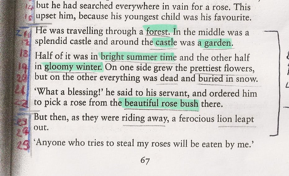
When referring back to the script analysis, lines 18 to 19 describe the seasons which the scene is set within - "Half of it was in bright summer time and the other half in gloomy winter". Since changing the traditional genre I could discard this factor, but as there are two contrasting seasons within this scene I have decided to contemplate its effect through the art of lighting.
Now the two smaller scenic elements of the campfire and flag stand act as a focus and contrast for the two 'seasons' to be depicted upon. As their usual positions are on opposite sides of the stage (flag stand SR and campfire SL) I thought these could be the perfect marking points for the translation of the different seasons. My initial thoughts are telling me the campfire (blazing and hot) instantly represents the bright summer side of the garden (in this case camp). And the flag stand (powerful and reflecting the lion's presence) could come across as gloomy like the gloomy winter within this scene as the lion could be dark and menacing creating a gloomy atmosphere upon the scene. The stand could be lit with dull, blue, cold lighting to reflect this feeling.
By setting up a makeshift photography studio I was able to experiment with this lighting idea and add these images to my research.

Lighting shot translating the two seasons

To achieve this I had two lamps directing light from either side of the model box (see previous photograph for layout). One with a blue filter, the other masked in an orange gel - these enabled me to split the set between the two seasons. Dull gels were used to damp the colours, as at first the orange gel seemed more powerful than the blue gel and therefore distracting the eye from the blue. Therefore to make the blue seem more powerful, the orange lighting was made softer. As the tribal flag was a symbolic piece in this scene I decided I wanted to spot light this from the front, covering it in a blue gel to still enhance the overall look of the scene. Each light and gel took a bit of time carefully positioning them and achieving the tone that I desired.
To translate the forest setting blue and green lighting was directed from either side of the model box.
Cacti Forest

In reality these photographs would be shown to the lightning managers and directors in a production meeting and discussed for consideration for the actual show.
Tuesday 18 January 2011
Sightlines
As a designer the consideration of sight lines play an important role in delivering an accurate design within the model box. Without this consideration some members of the audience may not have the view you think they have - take for example some structural element of the theatre itself may be blocking. In the original plans there are clear royal boxes jutting out from the front edge of the proscenium arch. I decided it was only right to include these in the model box. (I must admit the production of this element was harder than it looked on the plan.) After considering different ways of building these side boxes I decided to go with a supported tower-type structure - see photograph below for visual explanation.

The slats I produced to support the structure was very time consuming and tedious, none the less a couple of hours later all the slats were cut accordingly and complete. The next task was to cover these - easier said than done. As to the shape of these boxes, fitting a piece of card to it was not an easy feat. I tried various methods of measuring, cutting and bending the card to fit but I finally realised it wasn't going to look neat unless I produced these side panels in strips of card (well the curved section at least!).


Once this was successfully executed I could realise the stage from an audience member's view. See photograph below of view from the extreme seats.

From this I was able to consider my set design in a more technical way, taking in the consideration of blind spots. Also at this stage I began to realise how important the boarders (known as legs and teasers) of the stage perimeters are - they act as a barrier or boarder to stop the audience from seeing into the wings.
After the production of the scenographic model was complete my attention was drawn to that of the legs and teasers. These were constructed from black foam board - angled accordingly to prevent the audience from seeing into the wings. As I had gauzes in my design the teasers needed to not obstruct the positioning of these. The process of getting the angle and width of the legs and teasers was quite a lengthy process. This involved getting down to the audience's eye levels (in the centre and extreme seats) and taking note of what could be seen and altering the legs and teasers to prevent unwanted viewing. I attempted the technique of using a piece of string from the extreme seat position and stretching it out to the wing positions on the stage, although after I while I found this rather confusing so opted for the more conventional method of eyesight judgement!
As my set design was based on trucks I took into the consideration of the size of these trucks, in particular the moving cacti to enable the stage hands to move this piece of scenery on and off stage successfully - therefore I made sure the gap between the legs were sufficient to fit this piece of scenery through.
View from Stage Left Wing

View from extreme left seat

View from extreme right seat

Monday 17 January 2011
Cacti Forest
Script analysis of chosen scene

As seen from the extract above the Father travels through a forest. This part of the narrative is depicted within my set design through the concept of 'Cacti Forest'. Throughout the design process the idea of having the character of the father actually travelling through the a forest on stage has always been stirring. Within my original idea I had a forest made of lion's tails to depict the Lion's presence through this set piece. Although since delving into genre's this concept of a moving forest has become quite a subjective piece. Now set in the Wild West my forest is made of Cacti (giant of course - to add to the fairytale spirit). Main idea is to have 3 cacti per truck.
For this moment on stage to work the performers and scenic pieces would be synchronised in movement. Take for example, the father begins the scene in front of the first gauze before slowly starting his journey up stage (through the 'Cacti Forest'). The first gauze disappears to where the two Cacti trucks form a pathway for him to follow, these part side ways allowing him to continue up stage, as he reaches the second gauze this disappears to reveal the grand tepee of the Lion Prince.
Producing the Cacti trucks
Surrounded by dimensions and reference material I set to making the cacti. First a skeleton was made from wire (strong, 20 gauge beading wire - good for baking!)

Next I covered the wire in Fimo - FIMO PUPPEN. This type of modelling clay is oven-hardening and is particularly rich in contours, very expressive and stable in shape. After the basic shape was established I indented lines into the clay to gain the cacti texture as seen in one of my research images. A small dress pin was an adequate size and easy to control to achieve this effect.

Once finished they were oven cooked for 30minutes at 110C.

A lick of paint and the forest was nearly complete!

I gave the cacti a base coat and then applied a buff white mixed with sap green colour detailing on top, lightly applying and then rubbing with paper towel to achieve the desired effect.
Grass was added to the bottom of the cacti to add to the natural forest like essence. These were anchored to the pre made trucks with super glue and added to the scenographic model.

In reality these cacti would be approximately 4.5meters tall. In comparison to the figure these would be huge! But this is exactly how I intended it to be in order to portray the grand, overpowering, fairytale like forest effect upon the audience.
Sunday 16 January 2011
Campfire
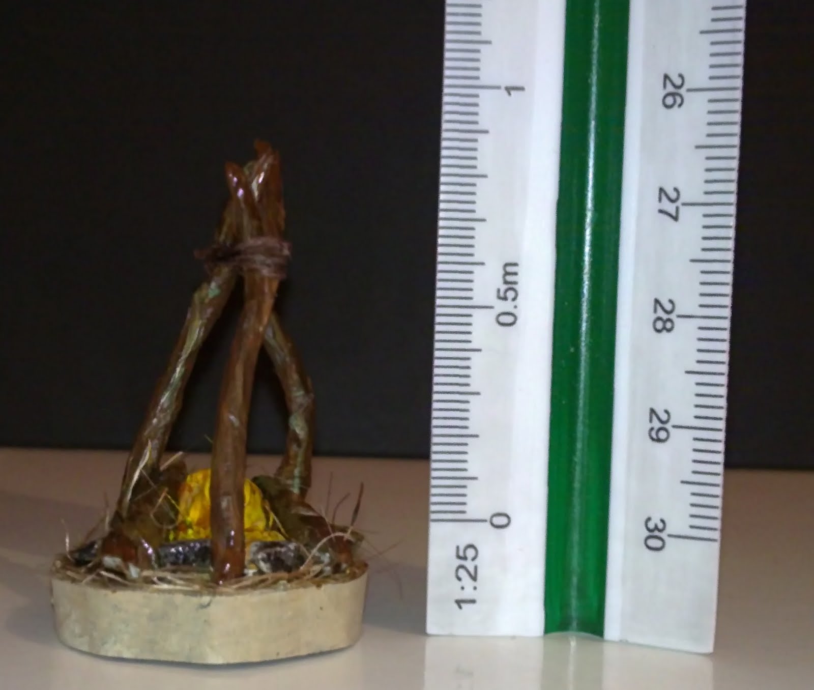
Within the narrative of the Lady and the Lion, there is a point in which the father goes on the hunt for a rose for his daughter. He travels through the forest and comes across a castle (the tepee) with a beautiful garden behind (the Indian camp), within this garden there is a beautiful rose bush in which he picks a flower from to take home for his daughter. Now when considering this concept in relation to the Wild Western/Native American genre I decided to change this rose bush to a campfire and to have the beautiful rose as a sacred ember from this fire.
Campfire in 1:25 scale form

Mounted onto circular truck measuring 800mm across (scaled to 32mm diameter)
Realising a blazing campfire for the stage
Before attempting to recreate a fire for the stage there are a number of things to consider. The main question being: what is the fire supposed to accomplish? Here I was reproducing a 'blazing' campfire which was not only eye catching but a key interactive element for the performers on stage. It would be there to also set the mood of the scene - reflecting the uneasy yet calming essence of the lion's lair. Another important aspect of design is whether I wanted visible flames or just an indirect flicking glow - as I was reproducing an open campfire I felt visible flames would be correct. For the consideration of colour, every fire is different and every colour has its own meaning. Did I want the colour of a warm glow or a cold heat. I opted for warm glow as after all the campfire I was translating was 'blazing'.
An interesting extract I found in a technical source guide on how to create fire for stage by Michael Powers (see research file for guide) gave me an insight into what the audience would depict from the colours I used.
"The more you use reds, oranges and yellows in flame, the more it will seem hot, searing and arid. Colours in the amber, rose and burgundy range tend toward romantic. Flames that are white hot, blue-white and blue tend to give the audience a feeling of unease, of very intense heat, or strangely enough, of cold heat. Green flashes can give a softening effect to the red range and add an eerie, unworldly effect when used as the main colour or mixed with the white and blue-white flames."
I wanted the fire to seem hot and searing so I decided to stick to the reds, oranges and yellow colour palette. Further research lead me to highlighting these in the Rosco catalogue when looking for suitable colour gels.
These colours would provided the flicking flames within my campfire truck. But how was I going to make these colour come to life in a 'blazing' fire - the answer fans! Further research made me discover how to recreate moving flames for a fake fire.

The illustration above shows how I visualised building the mechanism to recreate moving flames. A small computer fan would be contained and hidden within the campfire logs and operated remotely (preferably having a power supply with the truck - if the set constructors and health and safety would allow it, if not a smaller battery operated fan would suffice.) The air created by the fan would hopefully enable the 'flame shape' colour gels to move. Alternatively having small light and with coloured gels shining upwards at flowing silk would probably be more aesthetically pleasing. (See image below)
Giant Flame Faux Fire Silk

To create the surrounding log structure it would be down to the prop department to create me some authentic looking logs to suit.

One more point, to add realism to the campfire some sort of speaker system could be hidden within the logs to play crackling fire sounds!
See A3 Bible Sheet for Production Realisation of Campfire

Campfire in 1:25 scale form
Mounted onto circular truck measuring 800mm across (scaled to 32mm diameter)
Realising a blazing campfire for the stage
Before attempting to recreate a fire for the stage there are a number of things to consider. The main question being: what is the fire supposed to accomplish? Here I was reproducing a 'blazing' campfire which was not only eye catching but a key interactive element for the performers on stage. It would be there to also set the mood of the scene - reflecting the uneasy yet calming essence of the lion's lair. Another important aspect of design is whether I wanted visible flames or just an indirect flicking glow - as I was reproducing an open campfire I felt visible flames would be correct. For the consideration of colour, every fire is different and every colour has its own meaning. Did I want the colour of a warm glow or a cold heat. I opted for warm glow as after all the campfire I was translating was 'blazing'.
An interesting extract I found in a technical source guide on how to create fire for stage by Michael Powers (see research file for guide) gave me an insight into what the audience would depict from the colours I used.
"The more you use reds, oranges and yellows in flame, the more it will seem hot, searing and arid. Colours in the amber, rose and burgundy range tend toward romantic. Flames that are white hot, blue-white and blue tend to give the audience a feeling of unease, of very intense heat, or strangely enough, of cold heat. Green flashes can give a softening effect to the red range and add an eerie, unworldly effect when used as the main colour or mixed with the white and blue-white flames."
I wanted the fire to seem hot and searing so I decided to stick to the reds, oranges and yellow colour palette. Further research lead me to highlighting these in the Rosco catalogue when looking for suitable colour gels.
These colours would provided the flicking flames within my campfire truck. But how was I going to make these colour come to life in a 'blazing' fire - the answer fans! Further research made me discover how to recreate moving flames for a fake fire.

The illustration above shows how I visualised building the mechanism to recreate moving flames. A small computer fan would be contained and hidden within the campfire logs and operated remotely (preferably having a power supply with the truck - if the set constructors and health and safety would allow it, if not a smaller battery operated fan would suffice.) The air created by the fan would hopefully enable the 'flame shape' colour gels to move. Alternatively having small light and with coloured gels shining upwards at flowing silk would probably be more aesthetically pleasing. (See image below)
Giant Flame Faux Fire Silk

To create the surrounding log structure it would be down to the prop department to create me some authentic looking logs to suit.

One more point, to add realism to the campfire some sort of speaker system could be hidden within the logs to play crackling fire sounds!
See A3 Bible Sheet for Production Realisation of Campfire

Thursday 13 January 2011
Haunted by AutoCAD error
So today was the day my model box was scrutinised...I thought I had nearly completed my replica of the Margate Theatre with only a few finishing edges to complete. After taking the model box out of the privacy of my room and into the studio, praying eyes were looming over it. A voice said, "Do you think that's right? -(pointing to my apron). And suggested, "You might want to check that on the original drawings". So with reluctance I did and compared my measurements of my model box / printed AutoCAD drawing against the original plans. The result of this to my horror was that I had measured from the wrong point on my apron! Instead of measuring from the proscenium arch line to the edge of the apron, I only measured to the footlights marking. This in turn resulted in my apron being 23mm out or 575mm in reality being half a meter! This fact I just couldn't ignore I had to extend the apron on the model to fit. After 2 failed attempts at re measuring, I finally figured out how to add this extra piece on successfully - at least I could sleep better at night now.

Although due to this corrected error the stage floor I had already produced was to the smaller measurements, no worries I could simply move this floor forward as the painted floor did not need to reach the back wall of the stage as I had a back drop hiding this gap. Actually in reality this gap would allow the people working on the stage to be able to travel from one side to the other without being seen behind the backcloth - see photograph below for visual explanation.


Although due to this corrected error the stage floor I had already produced was to the smaller measurements, no worries I could simply move this floor forward as the painted floor did not need to reach the back wall of the stage as I had a back drop hiding this gap. Actually in reality this gap would allow the people working on the stage to be able to travel from one side to the other without being seen behind the backcloth - see photograph below for visual explanation.

Subscribe to:
Posts (Atom)